To blend, or not to blend
If you belong to Facebook groups or watch coloring-in blogs, you'll see wonderful examples of smooth graduated and blended colors.
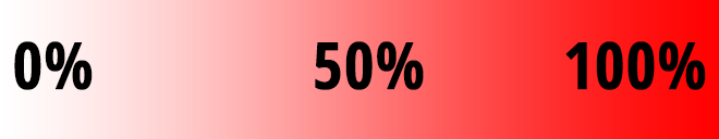
Graduated (or gradated) color is a progression of numeric values of the same base color. 0% is the complete absense of color, while 100% is full saturation.
Blended color is mixing two or more colors together to form a third color.
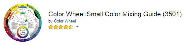
An inexpensive aid to blending colors is the use of a color wheel.
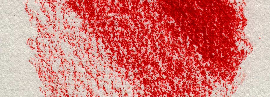
Blending colors with colored pencils, whether in coloring books or printed pages, doesn't change the mottled look of the colored-in areas. To do that, you must also smooth your colors.
Paper is pressed pulp, and as such it is very uneven. The surface is covered in tiny little peaks and valleys we often refer to as the "tooth" of the paper. During manufacture, drawing paper may be pressed and coated with a smoothing agent called "sizing". Sizing may also be water resistant to aid the artist in the creation of smooth lines with markers and ink.
Colored pencils float along this uneven surface, leaving behind traces of color that grabs onto the peaks, and rides over the valleys.
Smoothing is accomplished by burnishing or use of a solvent.
Burnishing is simply applying pressure that smooths the paper further. You burnish in your color when you press harder on your pencil. It also helps to sharpen your pencil so the point can get down into those valleys and create a more solid color.
Blending in a second color takes advantage of the gaps left after the first overpass by the first color.
Your options are:
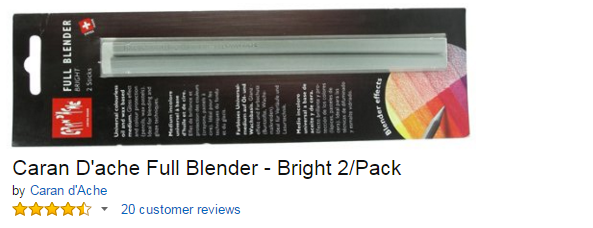
2. Full Blender:
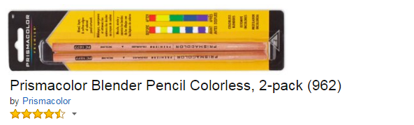
3. A white pencil from your color pencil set.
4. A pencil that is a darker or lighter shade.
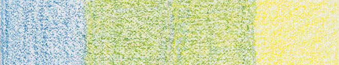
5. An analogous color (analogous means they are neighbors on the color wheel. e.g; yellow is a neighbor of orange). This works well to brighten or darken your colors, and you can certainly combine both darker and lighter analogous colors to create shadows and shine.
Use another pencil to color over the base color with increasing pressure to fill in those gaps and create a smoother appearance. A word of caution. If you layer too much you risk uneven color, flaking, and wax bloom. Different brands of pencil have different results. Only experience with your chosen tools can teach you the best time to stop.
The smoothest look is obtained by the use of solvents. Solvents melt the color and allow it to be smeared. With a light, careful touch you can create beautiful, seemless effects with colored pencil and solvents. There are three types of colored pencils and each needs a different type of solvent.
Wax: baby oil, mineral oil, alcohol
Oil: turpenoid, mineral spirits
Watercolors: water, of course.
When blending and smoothing your colors move your hand from the lightest areas into the darks, and then you can draw the darks into the lighter areas if so desired.
This is a basic sketch of an apple made with Prismacolor Premeir colored pencils, which are waxed based.
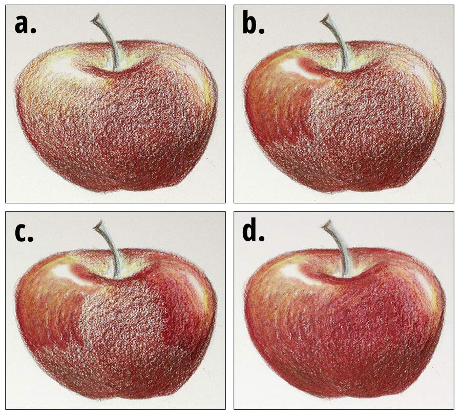
Figure a. is the apple without any blending.
Figure b. was blended with baby oil on the left.
Figure c. is the same apple, with Vaseline blended on the right.
Figure d. I used alcohol to blend the remainder of the apple. As you can see, there is very little difference in the result using the different solvents.
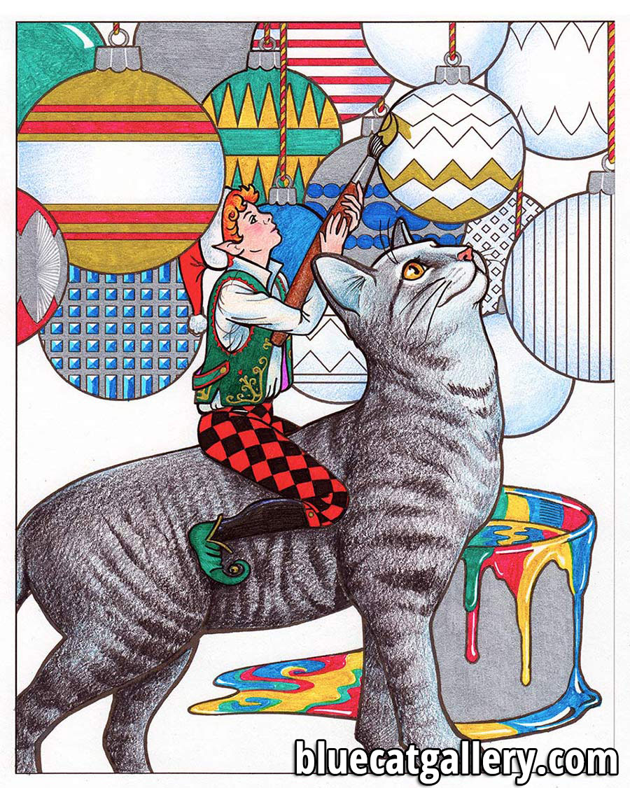
Sometimes, texture is desired. One example of this is the cat's fur in this picture:
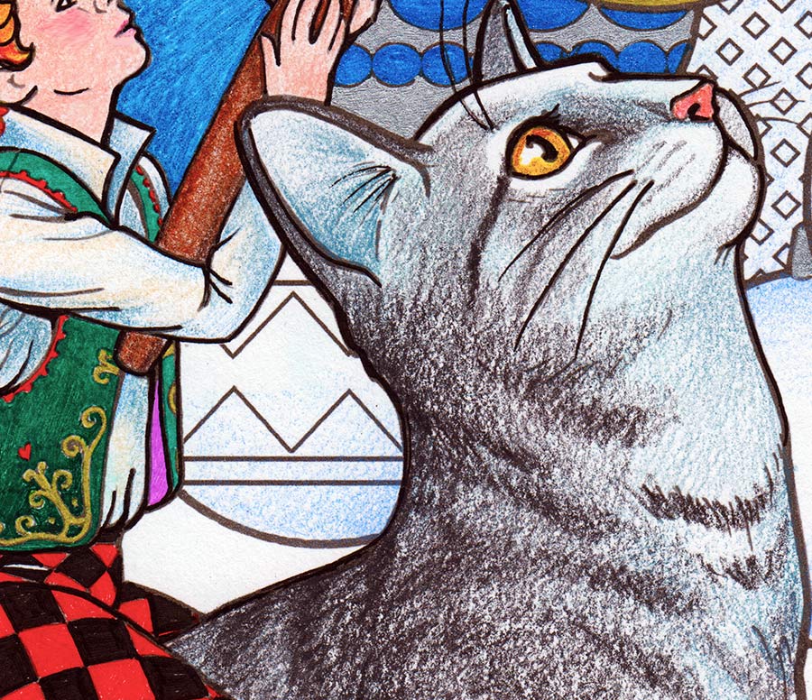
If you look closely, you'll see the progression of work. First, I used a very light touch to apply a medium blue over all areas of the coat, except peak highlight areas - the top of the head, bridge of the nose, and muzzle. I went a little heavier, but not much, in areas that were in shadow.
The second color I used was 70% grey, basically going over most but not all of the blue, in the same way. I let the blue stand out in areas that would be white or much lighter grey, on the cat.
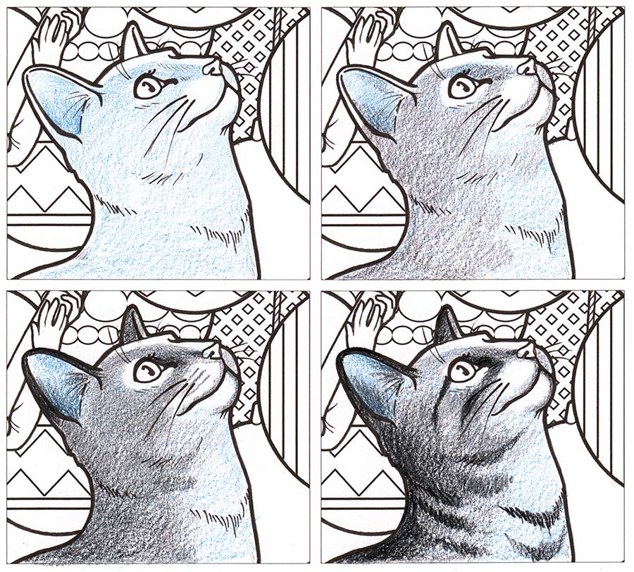
Taking a 90% grey pencil, I darkend the back of the neck, shoulder, back of the legs, belly, rump, and the part of the back leg that angled down. These are all shadow areas.
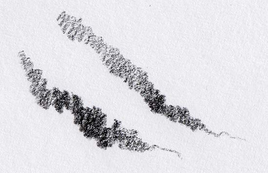
I did not blend. The texture of the paper caught the pencil in such a way that my short even strokes looked like little bits of fur. I let the paper do the work for me.
Using the same 90% grey, I added stripes. While they look difficult, they're really just scribbles. I pressed harder when they were in shadow, and fainter when they were in the light. I went over and touched them up, darkening as needed.
The roughness of the coat, juxtapositioned with the soft glow of the unpainted ornaments (light blue, blended with baby oil) and the shine and sparkle of gel pens, especially in the cat's gold eye, create a variety of texture and interest in the picture.
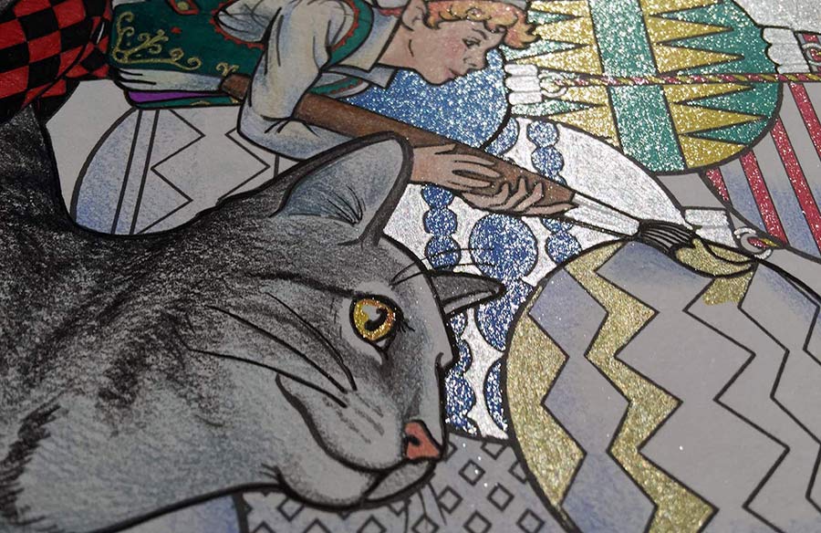
And here is the final result: