Coloring lighter skin
Coloring skin is challenging, because skin is not one single color. We're not just talking about the various skin tones seen across the human race, but the landscape of every individual is full of highlights and shadows and reflected colors. Coloring in a person is not like coloring a still life. We move, and so do the colors that play upon our skin. There's nothing wrong with cartoon colors. You can certainly pick up one pencil and color all exposed skin that one flat color. But if you want a more realistic look, then you need to move away from "skin tones" and select from a full spectrum of colors.
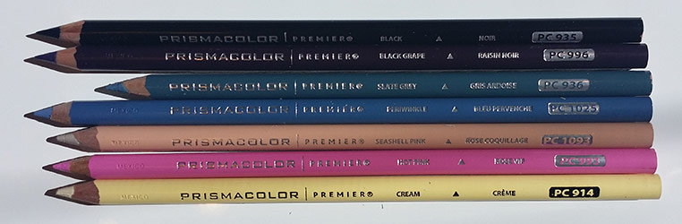
The Korean Girl is one of the free printables from my latest book, Color Me Beautiful, Women of the World. I printed it right from my website onto standard printer paper with my inexpensive Dell printer (E310dw). To color the skin I used seven prismacolor premier pencils:
Cream: PC914
Hot Pink: PC993
Seashell Pink: PC1093
BlackGrape: PC996
Slate Grey: PC936
Periwinkle: PC1025
Black: PC935
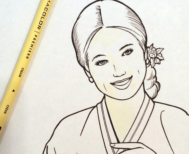
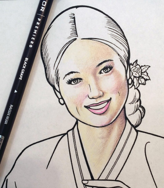
The first picture shows the application of Cream, a pale muted yellow. I left the brightest areas uncolored. The white of the paper shows through. There will be a transition from the white highlight to the medium tone of the skin, and those are the areas that I colored cream.
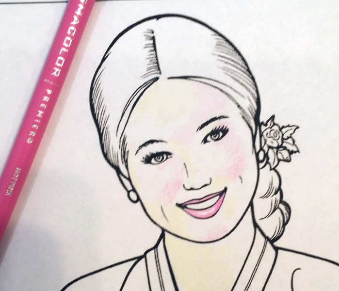
The second picture shows where I applied hot pink. The lips and blush areas. Because I have the light coming from the left side of the picture, the blush will be deepest on the opposite side.
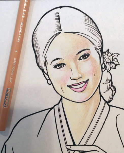
Third picture, Seashell Pink. This is my medium skin tone, and where you really start to see the contours of the face starting to take shape. I use a very very light touch and then layer more and more color where the color is deeper. The darkest areas are beginning to show shadow - the right side of the picture, nose, jaw, cheek, eye socket, forehead, and the contours of the neck. I am leaving the hands white right now and will come back to them later.
Fourth picture, Black Grape. This is a deep purple that I work into the shadows, pulling the hot pink up the jawline, and blending into the deeper areas of Seashell pink.
Fifth picture is Slate Grey. I used a very sharp point and layered the color with a light touch to the left side of the picture, nose and cheek, and right side of the forehead and neck.
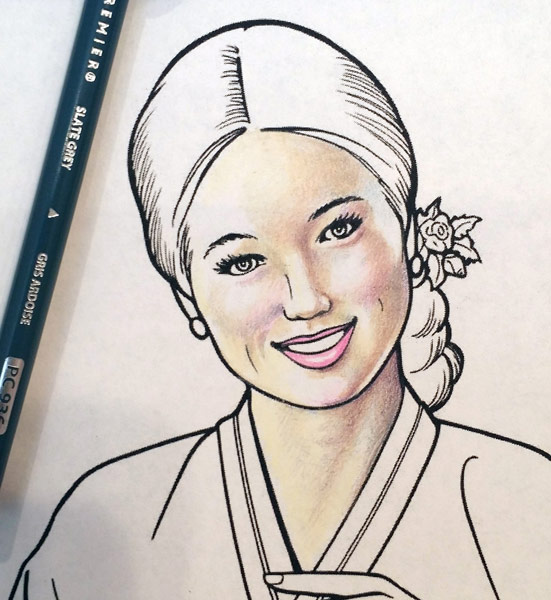
Finished picture. I added Periwinkle to the right side of the face, in the highlights at the temple and shadows on the neck. I used the black, sharpened very finely, to give the slightest indication of teeth at the sides of the mouth. I used medium brown in the eyes. I used two shades of blue and black marker on the hair.
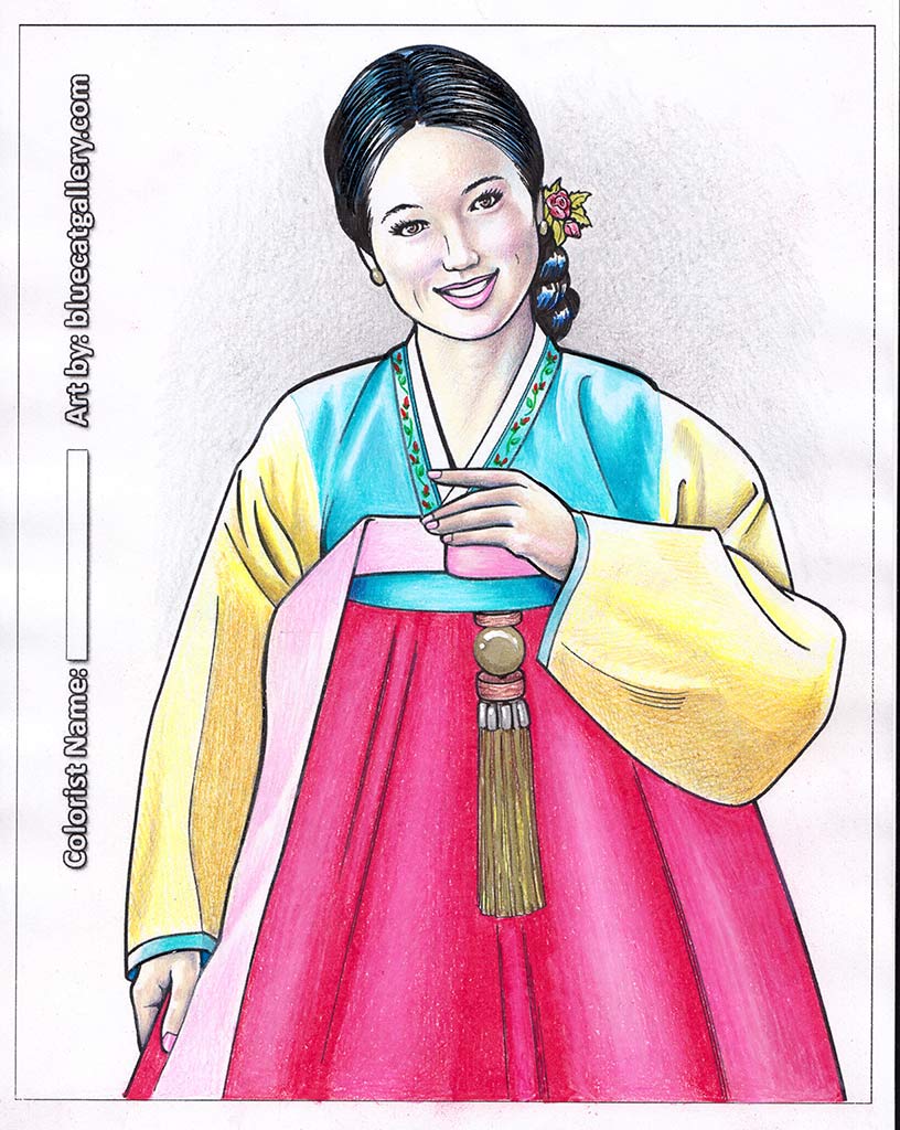
The remainder of the picture was colored with prismacolor pencils and gel pens for the tassel and decorations on the collar. I like to use three similar shades on fabric - a deep shade for shadows, a medium shade for the base color, and then blend with a very pale color in the same family. I used slate grey pencil for the background.
If I did it again there are many things I would change... but that's the fun of it. Print out another copy and play around until you're happy with the results.
If you are interested in trying your hand coloring the illustration used in the above example, visit my gallery page to download and print it.